BREWD
Marketing Collateral
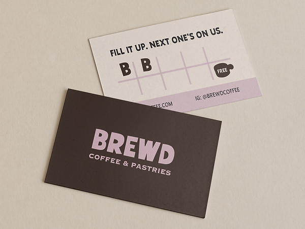
The problem was introducing a new cafe to the neighborhood with a voice that felt loud, fun, and distinct from typical quiet coffee shops. The direct mailer and loyalty card were structured to prioritize bold brand personality over standard product imagery, relying on massive visual weight to command attention. This approach instantly establishes a memorable local identity.
Deliverables: Loyalty Stamp Card, Direct Mailer


A new cafe needed its takeaway packaging to break away from the quiet, minimal look of typical coffee shops. To command attention, the design creates sharp contrast by pairing a heavy, dark brown carrier and thick typography with playful pink-striped cups. This deliberate visual weight transforms ordinary disposable items into loud, memorable brand pieces that easily stand out on the street.
Deliverables: Paper Cup, Paper Cup Carrier
