
VIVUS
Cover Layouts
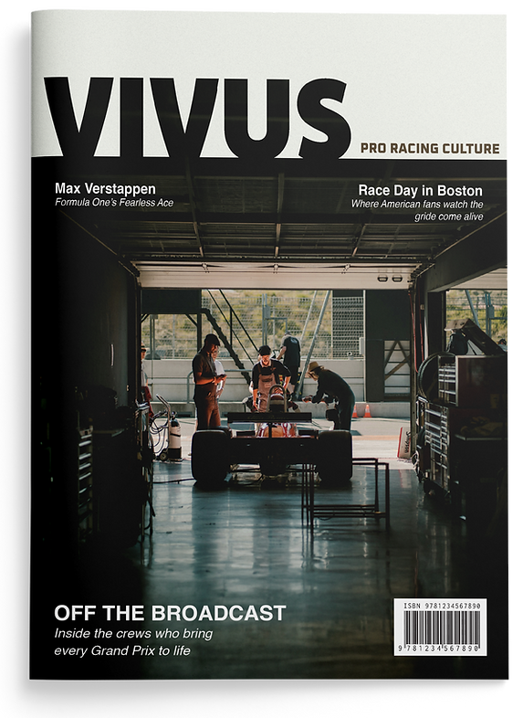
The challenge was building a unified cover system that feels authentic across completely different racing disciplines. To solve this, a heavy masthead was paired with moody, documentary-style photography and strictly restrained cover text to let the imagery take over. This approach creates a serious, grounded newsstand presence that focuses on the real culture of pro racing rather than just flashy action shots.
Deliverables: Magazine Covers


Balancing F1’s aggressive energy with the need for long-form legibility required careful editorial pacing. A disruptive, high-impact opener was designed to capture raw speed before immediately dropping into a strict, conservative grid for the dense body copy. This structure hooks the reader with the sport’s adrenaline upfront while ensuring a clean, focused reading experience.
Deliverables: Articles Layout


The challenge was formatting dense utility pages like gear guides without dropping the magazine’s fast-paced F1 energy. To solve this, the heavy information was structured using sharp diagonal image cuts and strict grids to force forward visual movement across the layouts. This approach maintains momentum, ensuring these highly functional sections carry the exact same aggressive tone as the main features.
Deliverables: Departments Layout

